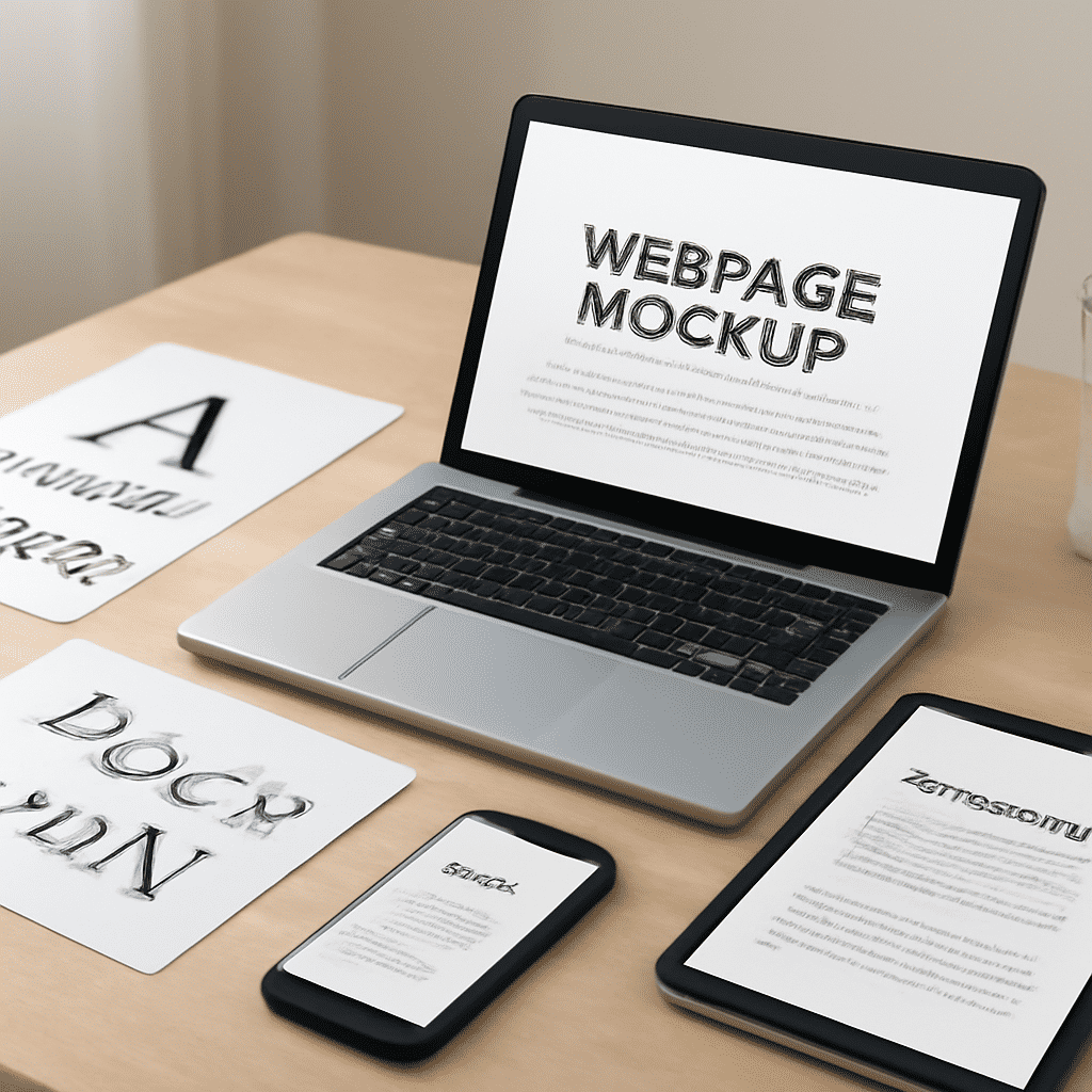
Typography has always been an essential component of design, and with the digital world expanding at an unprecedented pace, its importance is more pronounced than ever. On the web, typography plays a crucial role in not only conveying information but also enhancing the overall user experience by increasing readability and engagement.
Effective typography on the web isn't just about choosing a typeface; it's about understanding the best ways to use text to communicate clearly and aesthetically. This involves a myriad of considerations—ranging from font choice and size to spacing and color. Each of these elements contributes to how text is interpreted and interacted with by users.
Font Selection
Choosing the right typeface is an art in itself. A font has a voice, and the right choice can set the tone for a website. Sans-serif fonts, for example, are often chosen for digital interfaces due to their clarity and modern look. They offer simplicity, making them ideal for screens where legibility is key. However, serif fonts can convey elegance and tradition, adding a classic touch that may be suitable for certain brands or themes. It's crucial to balance aesthetics with functionality, ensuring that the selected font aligns with the site's purpose and audience.
Size and Hierarchy
The size of the text impacts not only readability but also the flow of information. Hierarchy is achieved by varying font sizes to guide the reader's eye through the content. Larger fonts are typically used for headings, creating a focal point that draws attention. Subheadings are smaller, organizing content into digestible sections, while body text is kept consistent and easily readable.
Spacing and Layout
Line spacing, or leading, is another key factor in ensuring readability. Adequate space between lines prevents text from looking cramped, making it easier for users to follow along. Letter spacing, or tracking, can affect the mood; tighter spacing can convey a sense of urgency, while looser spacing can exude openness and calm.
White space is an often underrated element in web design and typography. It provides visual breathing space and allows users to focus on the content. A cluttered page can overwhelm viewers, whereas a well-spaced layout guides them naturally and intuitively through the site.
Color and Contrast
Color can significantly impact the effectiveness of typography. It helps in creating contrast, which is critical for legibility. Text should stand out against its background, ensuring that information is easily discernible. High contrast is crucial for readability, particularly for users with visual impairments or those viewing content on different devices and under varying lighting conditions.
Consistency
Maintaining consistency throughout a website establishes a cohesive visual language. This can be achieved by following a style guide that dictates typography rules for different elements, such as headings, body text, and links. Consistency not only boosts readability but also aids in building brand recognition and trust.
Responsive Design
With the rise of mobile browsing, typography must be adaptable to multiple screen sizes. Responsive design techniques are essential to ensure that text remains legible across devices. Techniques such as fluid grids and flexible layouts, where text size and spacing adjust based on screen size, can greatly enhance the user experience.
In conclusion, web typography is a blend of art and functionality, encompassing choices that affect readability and aesthetics. By carefully considering elements such as font selection, size, spacing, color, and responsiveness, designers can create engaging and user-friendly digital environments. The art of typography is about crafting visual stories that communicate effectively and leave a lasting impression on the audience.