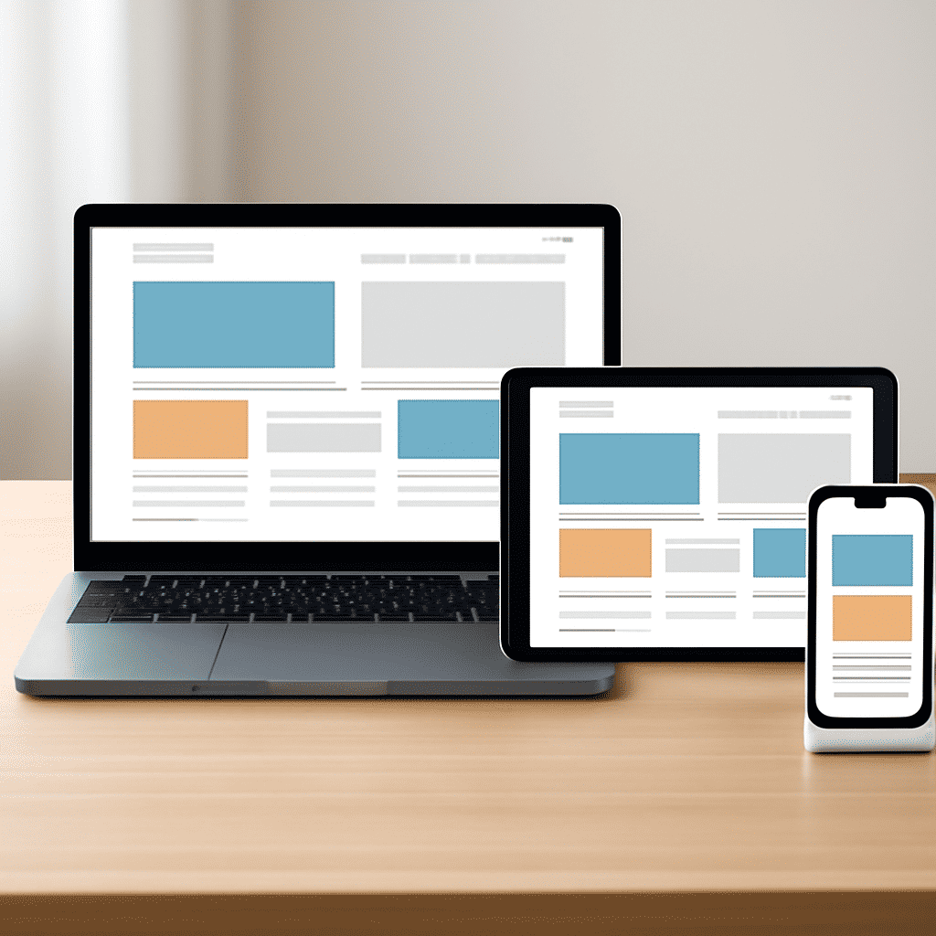
In today’s digital age, crafting a design that is both visually appealing and functional across various devices is essential. This is where adaptable design methods come into play, offering solutions to the challenges presented by the wide array of screen sizes and resolutions used by consumers. These techniques ensure that irrespective of the device, the user experience remains optimal. Below are some fundamental strategies for achieving adaptable designs:
Fluid Grid Layouts
One of the core principles is the use of fluid grid layouts, which rely on proportional measurements rather than fixed units like pixels. This approach allows elements on a page to resize and reposition themselves relative to the screen size. By designing layouts with percentages, developers ensure that the content flows smoothly regardless of whether it’s viewed on a large desktop monitor or a compact mobile screen.
Flexible Images
Images must also adjust seamlessly to varying screen dimensions. This can be achieved by setting their maximum width to 100%, allowing them to scale down as needed rather than exceeding the bounds of smaller screens. Additionally, techniques like the srcset attribute in HTML help in serving different image resolutions tailored to specific devices, thereby optimizing both aesthetics and load time.
Media Queries
Media queries are a powerful tool that enables designers to apply different styles based on the characteristics of the device rendering the content. By specifying conditions such as minimum and maximum width, height, or even orientation, you can tailor the presentation of a website for particular devices. This ensures that content remains legibly formatted and aesthetically pleasing, whether users are browsing on a smartphone in portrait mode or a widescreen laptop.
Responsive Typography
Adjusting text to be legible on various screens is another crucial aspect. Responsive typography involves using scalable units like em or rem for font sizes, allowing text to dynamically adjust according to the device's viewport. This not only enhances readability but also maintains a harmonious visual hierarchy across different platforms.
Prioritize Content with a Mobile-First Approach
Developers are increasingly adopting a mobile-first approach, beginning design processes considering the smallest screens first before scaling up. This strategy helps identify and prioritize essential content elements, ensuring that the most critical information is accessible on mobile while additional features enhance the experience on larger screens.
Testing Across Devices
No design is complete without thorough testing across a variety of devices and browsers. Emulators and responsive design testing tools can offer insights into how a design performs across different environments. However, nothing beats real-world testing on actual devices to ensure a comprehensive understanding of user experience and pinpoint any potential issues.
Accessibility Considerations
Ensuring that designs are accessible to all users, including those with disabilities, should be integral to the design process. This involves choosing contrasting colors for readability, making interactive elements focus-friendly, and ensuring that navigation is intuitive via keyboard.
Conclusion
Implementing adaptable design techniques requires foresight and care, focusing on a user-centered experience that transcends the limitations of specific devices. By integrating flexible layouts, responsive elements, and thorough testing, designers can create digital environments that are not only visually captivating but also universally accessible. As technology continues to evolve, mastering these techniques becomes increasingly central to delivering compelling digital experiences.