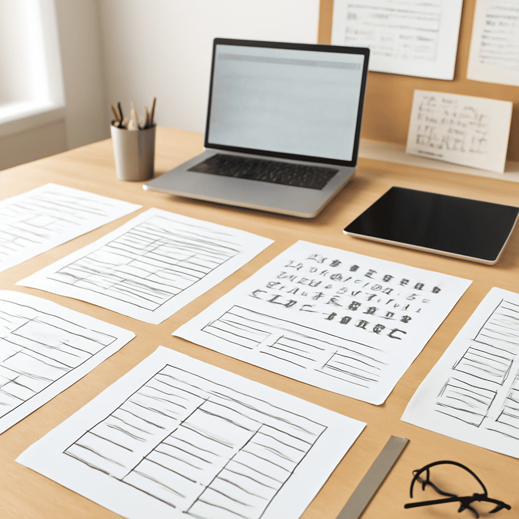
Typography and layout are pivotal components in crafting a visually appealing and user-friendly digital environment. These elements significantly affect how users perceive and interact with a webpage, impacting clarity, engagement, and the overall user experience.
Typography: Crafting a Voice Through Text
Typography is more than just selecting a font; it involves choosing the type, size, color, and spacing of the text, which altogether create a visual language on the page. Good typography ensures that the content is legible and accessible, contributing to the ease with which users can consume the information.
-
Font Choice: Selecting the right font is essential. It should align with the visual identity of the website and cater to the preferences and needs of the target audience. Serif fonts often convey formality and tradition, while sans-serif fonts can offer a modern and clean look.
-
Hierarchy and Structure: Establishing a clear typographic hierarchy helps guide the reader’s eye from the most critical sections to the least. This can be achieved through variations in font size, weight, and color. Headings should be easily distinguishable from body text to provide clear navigation cues.
-
Readability and Legibility: These are crucial for maintaining user engagement. Adequate line spacing, appropriate text alignment, and high contrast between text and background are fundamental to ensuring text is easy to read on different devices.
Layout: Organizing Information for Optimal Interaction
The layout of a webpage determines how elements are arranged on the screen, directly affecting the flow of information and the ease with which users can navigate through the content.
-
Balance and Symmetry: A balanced layout creates a sense of stability and harmony. It involves the strategic placement of text, images, and other elements to achieve a visually pleasing arrangement. Symmetry can offer a neat and organized appearance, while asymmetry can capture attention and encourage exploration.
-
Space Utilization: Effective use of white space, or negative space, prevents the page from feeling cluttered and overwhelming. White space helps isolate different sections, allowing users to focus on one piece of information at a time.
-
Consistency: Consistent layout across different pages ensures that users have a cohesive experience. This means maintaining uniformity in the positioning of navigation elements, headers, footers, and other recurring components.
-
Responsive Design: With the diversity of devices used for browsing, layouts must adjust seamlessly across various screen sizes. Responsive design ensures that the structure of content remains consistent and accessible, whether viewed on a desktop, tablet, or smartphone.
Enhancing User Experience
The interplay between typography and layout is critical in guiding users through a narrative effectively. A well-thought-out combination of these elements enhances comprehension and retention, offering visitors a smoother interaction with the content.
In summary, typography and layout are not mere aesthetic choices but essential components that shape how information is perceived and interacted with online. By thoughtfully combining these elements, web designers can create intuitive and engaging experiences that resonate with users, ultimately achieving a well-rounded and effective digital presentation.